It was only fitting. The font of creativity at the Fund’s Portland, Oregon-based ad agency Wieden+Kennedy was presented with his own font.
David Kennedy’s unique penmanship is stylistic and notable around the office. It has been seen by everyone because he rarely uses a computer. It is so distinctive that one of the this year’s students in “12”, Wieden+Kennedy’s advertising training school, decided it would make a terrific font.
He carefully studied the slant of the letters, the way Kennedy formed capitals versus lower case letters, and how he linked his letters to create continuity on the page when creating the font, to be named “Kennedy,” with the goal that “everyone can write like Kennedy.”
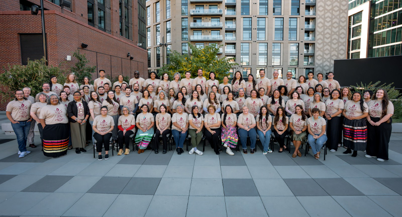
The font will be sold commercially and all proceeds will benefit the American Indian College Fund, his favorite charity and the beneficiary of Wieden+Kennedy’s outstanding pro bono creative work for more than two decades. Kennedy was presented with the font’s unveiling during a visit by the American Indian College Fund.


